top of page
Designing an Identity for the first Kannada architectural quarterly magazine - Saakruti, aimed at bridging the gap in the rising local interest towards vernacular and sustainable architecture, particularly in towns.
Saakruti
Client : Malayala Manorama
Identity, Editorial
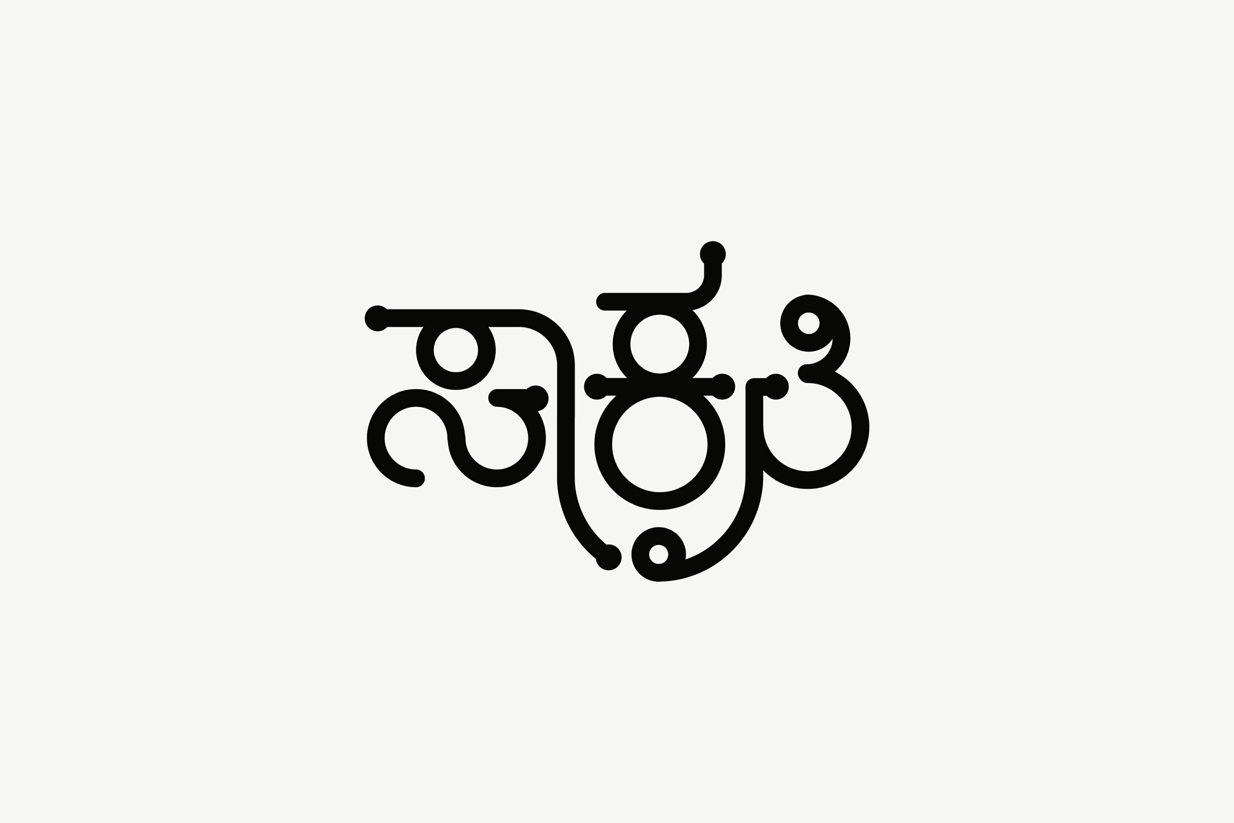


"The magazine's name, 'Saakruti,' meaning 'essence of good form,' was chosen to reflect vernacular values. To capture this essence, a design system using circles and segments, which are also foundational to the structure of Kannada letters was developed. This approach shaped both the central visual and the overall layout.
Together with a simple yet distinct sunny yellow, black, and white colour palette, the visual identity was distinct, exuding a unique presence on local store shelves and effectively setting it apart from other popular magazines."

All Projects

Nitya Prarthana Books

Friendship with Science

K Viswanath film festival

Squareworks

Eta Labs

Aryaa

Vijaya Foods

Benne Mangoes

Aastrika Foundation

Mysuru Yoga Utsava

Tromke

Bimba
bottom of page